Patient Access Hub
Redesigning online booking so patients feel guided, not overwhelmed
Most patients avoided the portal and called the clinic instead. The first step forced them into confusing department lists and codes that belonged to staff, not to patients. It created hesitation, errors and a sense that online booking was risky.
I led the redesign of the booking experience inside the existing portal. The goal was simple
help patients describe what they need in their own words, route them to the right care automatically and make the entire flow feel safe, predictable and human.
The new Patient Access Hub increased online completions, reduced simple booking calls and became the primary way patients manage their visits.
About This Project
Extending an existing portal so patients finally trust online booking
The organization already had a patient portal, yet most patients still called the clinics to book care. The booking feature exposed internal scheduling codes and department lists that made sense to staff, not to patients.
My role as Senior UX Lead was to redesign booking inside the existing portal, not by replacing anything, but by adding a smarter, more human layer on top of the legacy system. I partnered with a product manager, three engineers and operations.
The new Patient Access Hub significantly increased online bookings and reduced call-centre load.
Old booking flow on the left, new “What do you need help with” entry on the right.
.png)
Problem and constraints
Patients avoided the portal because
• The first step forced them to choose from confusing appointment types
• The language felt like an administrative form
• There was no unified place for prep instructions or multiple clinic visits
• They feared choosing the wrong thing and preferred calling
The constraints were clear
• Legacy scheduling systems could not be rebuilt
• Navigation of the portal had to stay intact
• We had to introduce new logic without breaking old flows
The challenge was to Add Clarity, Safety and Guidance inside the existing structure.
Old portal screenshot focused on the appointment type dropdown.
.png)


Research, insights and mental model
I led a discovery phase combining diary studies, interviews, shadowing and analytics.
Patients consistently behaved and thought in one pattern
• I tell you what is wrong
• You tell me what kind of visit I need
• You show me when and where I can go
• You remind me of what to do before and after
They thought in life events, not in system codes.
Analytics revealed
• The highest drop-off at “choose appointment type.
• Heavy use of “Other reason” that the backend could not interpret
• Huge Monday call spikes from weekend portal failures
The portal’s language, flow and prep info were completely misaligned with real behaviour.
.png)
.png)
Design Decisions and Flows
I tested three structural concepts inside the existing portal.
Option A
A full-screen wizard triggered by the existing “Book visit”.
Option B
Split view with questions on the left, live time slots updating on the right.
Option C
Scenario cards replacing the old entry point.
From usability sessions
• Anxious or low-tech patients felt safest with Option A
• Confident users moved fastest with Option B
• Option C felt intuitive and familiar within the portal
I made a hybrid recommendation
Start with the scenario cards and branch users into the wizard or split view depending on the first answers and known usage patterns.
Engineering confirmed feasibility without changing any backend logic.

.png)


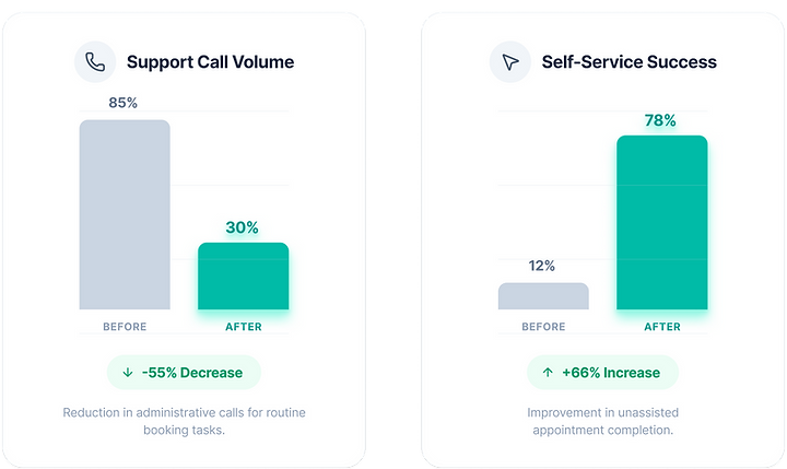
Results and Reflection
After release
• Simple booking call volume dropped noticeably
• Online booking completion increased
• Patient clarity scores improved around preparation and expectations
• Clinics reported fewer wrong-type bookings
This project worked because we respected real behaviour, not system assumptions. The largest shifts came from plain language, smart routing, and giving patients clear preparation before they hit “confirm.