

About EsayCheck Web Application
EasyCheck is an innovative retail network tool tailored for the FMCG supply chain in South America. This platform is focused on injecting transparency and real-time information flow into the retail ecosystem, making it more efficient and responsive.
The essence of EasyCheck lies in its consumer-centric approach. It's engineered to align production closely with consumer preferences, ensuring that the diverse needs of South American consumers are met swiftly and accurately. This approach is vital in a region known for its rich cultural diversity and rapidly evolving market trends.
For small businesses, which form the cornerstone of local economies, EasyCheck is a transformation tool. It offers a window into market dynamics, providing insights that are not just data-driven but also actionable. This empowers these businesses to stay ahead of the curve, ensuring they can cater to their customers' desires effectively and efficiently.
In essence, EasyCheck isn't just a technological advancement; it's a conduit for keeping businesses in tune with the heartbeat of South American consumer demand, ensuring harmony and fluidity throughout the supply chain.
Problem Statement
Small businesses within the supply chain are experiencing significant inefficiencies and miscommunication, leading to a host of operational challenges that impact their sustainability and growth.
Business Ask
There is a critical need for a solution that enables FMCG companies to effectively track last-mile sales data. This solution must provide vital insights into the end-stage retail activities to enhance decision-making and operational efficiency.
Human Centred Design Approach


Empathize

Research
Competitive Research
Before we entered Primary Research, we wanted to know about similar web applications that are already on the market. we want to know the advantages and disadvantages of each application. Do they have the features the user needs?


Qualitative & Quantitative Research
In leading the research for the EASYCHECK web app, we conducted unstructured, in-depth interviews with various buyers and users. These conversations provided valuable insights into their experiences, preferences, and feedback related to the app's functionality and usability. This qualitative approach allowed for a deeper understanding of the users' needs and expectations, which is crucial for refining and enhancing the EASYCHECK web app to better serve its target audience.


User Insight
The first step in addressing the needs of our primary stakeholders, the CPG companies using our cloud service, involved engaging in detailed conversations with them. This approach helped us in dissecting and understanding their challenges more thoroughly. From these discussions, we could break down their problem into three distinct parts, forming a clearer picture of their needs and the areas where our service could be enhanced to better support their operations.
Developing Real-Time Retail Insights: Implementing features that provide immediate, actionable data to enhance decision-making in retail's last mile.
Streamlining Distribution Process: Creating solutions to ensure distributors can meet demands efficiently and on time.
Supporting Retailers with Working Capital: Offering tools or insights within the app to help retailers manage and optimize their working capital more effectively.
Enhanced Customization: A desire for more personalized app settings and features.
Seamless Integration: Requests for better integration with existing business tools.
Improved Onboarding: A need for simplified, intuitive learning resources for new users.
Reliable Performance: Emphasis on consistent and reliable app functionality.


We wanted to find the cause!
We talked to multiple CPG executives, Distributors, and Retailers. We observed them do their business and shadowed them for days.
Based on this fieldwork, we were able to create a map of issues faced by each of the players in this ecosystem. Each one of them had a unique set of problems. Most important were the things that CPG companies wanted and the problems faced by the retailers at the last mile retail.


![20945999 [Converted].png](https://static.wixstatic.com/media/a7d1b4_1908fb0b117846f7a5c9d8a249552006~mv2.png/v1/fill/w_276,h_278,al_c,q_85,usm_0.66_1.00_0.01,enc_avif,quality_auto/a7d1b4_1908fb0b117846f7a5c9d8a249552006~mv2.png)


Public Survey
We talked to multiple CPG executives, Distributors, and Retailers. We observed them do their business and shadowed them for days.
Based on this fieldwork, we were able to create a map of issues faced by each of the players in this ecosystem. Each one of them had a unique set of problems. Most important were the things that CPG companies wanted and the problems faced by the retailers at the last mile retail.

88%
Users are seeking automated solutions for streamlined processes.
90%
Users desire a system that simplifies their tasks, removing the need for meticulous, manual effort and providing a more efficient, seamless workflow.
100%
Users are seeking to save time and money.
100%
Users desire a system that provide data visibility and actionable information.
_edited.png)
Define

User Personas
I spearheaded the creation of user personas within my team, drawing from interview insights. This approach was crucial for anchoring our design decisions in real user data, providing a clear direction for developing an app that's truly user-centric. Crafting personas helps us to empathize with and prioritize the user experience throughout the design process.


Empathy Map
I've constructed an empathy map to dive deep into the user experience for EASYCHECK, identifying actionable insights that will inform the design process. This tool helps us empathize with our users, capturing what they express, their underlying thought processes, observable behaviours, and emotional reactions related to their interactions with the app. Through this map, I aim to translate user feedback into features that resonate with their needs and enhance their interaction with the product.


User- Future Journey
We evaluated the provided Future Journey visual for Ground Floor Experts - Users and found that it effectively mapped out a comprehensive user experience timeline. It included strategic milestones, emotional states, and touchpoints that evolved from new to mature stages. This user-centric approach facilitated a deep understanding of user interactions over time, aligning with their evolving needs and emotional responses. The visual also seemed to incorporate feedback mechanisms for continuous improvement, ensuring the app remained relevant and effective.
%201%20(1)_edited.png)
Ideation

Solution Design
Our initial user research indicated a systemic design issue within the supply chain ecosystem involving CPG companies, distributors, and retailers. The existing distribution system was inefficient, causing stock imbalances at the retail level. Retailers struggled to timely communicate their inventory needs, leading to missed sales opportunities.
To address this, we devised a solution that optimizes information flow among all parties, ensuring real-time data exchange from the ground up. Our investigations revealed that reliance on traditional Excel Sheets for transactions was hindering data accessibility for CPG companies, obscuring insights into sales trends and inventory levels. Our concept transforms this process, digitizing the data for enhanced clarity and responsiveness.
This solution had multiple parts
-
A point-of-sale device
-
CPG Dashboard to monitor real-time data
-
Distributor platform
-
Cloud Control center to monitor all active devices in the field
-
Financial interface


Through this integration, we connected all components of the system, offering real-time insights into sales, inventory, orders, and invoicing.

Information Architecture
In developing the Information Architecture, we addressed the obscurity within last-mile retail transactions. The goal was to transform disjointed data from Excel sheets into a coherent system, enhancing transparency and streamlining the business process. This led to a user-centred design that illuminated key data, facilitating easier access and interpretation.


Idea Sketch
After defining the flows, we started working on design concepts. A big part of the problem we were trying to solve involved dealing with huge amount of data and dynamic information that needed to be sliced and diced by the end users. So we spent time on crafting easy to use data visualizations.

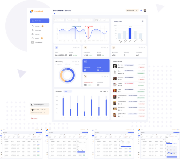
Design

Once we had the data started coming in, another big challenge ahead of us was to figure out how we slice and dice the huge amount of data that our users to help them generate insight from this data.
The toughest one was for the CPG dashboard. At any given point, the executives should be able to review real-time data across locations, time frames and huge sets of product categories.
We explored multiple design solutions for the filters. Every time go back to the users and test each design. With constant feedback and active involvement of the end users, we were able to quickly prototype and refine these early designs.

When we interviewed our stakeholders, we realized that they were all looking for multiple ways to view this complex mesh of data so that they could make sense of it. To understand this, we asked them a lot of questions and documented what they were saying.
Just to give an idea, these are just some of the many permutations and combinations they were thinking of:
Sales trends based on regions, and categories.
Abnormality in sales and stock out.
Change in market share over some time, continuously losing market share?
Sales Trend using product filter, time filter and area filter.
Summary of Top 'X' selling and Bottom 'X selling products using time and area filter.
Summary of Top 'X' selling and Bottom 'X' products which have shown maximum sales growth [based on 3 months prior sales average and average during the promotion].
So we created a structure to help analyze these permutations and combinations into an easy-to-use user experience model.

Putting It All Together
After a lot of back and forth, and having done these individual studies on the key components of the interface - The Layout, Filters, Data-point visualizations etc. we started putting it all together to create a cohesive user experience.
We got a mixed response to our initial design proposal from the users. On one hand, the users loved the amount of data they can analyze in real-time and how they can mix and match different data-sets. But they were not able to understand the filters properly. They specifically didn't understand the drop-down filter. Every time they would need to open it, the rest of the user interface moved down. A lot of movement was also felt as a distractor.
This was a classic problem where we went a little overboard with our ambition to create highly interactive data visualization without realizing how users are going to react to it.
Users complained that direct manipulation of category and location fields was not possible unless you opened the filter dropdown. This also resulted in two extra clicks to get the job done.
Lastly, we also got mixed reactions on the choice of colors. Most of the users felt distracted by the use of bright colors and a very strong accent color. The key information was losing focus and the user's eyes were directed more toward the action buttons.
We had realized that we got few things right and few things wrong.
It was time to iterate on the designs based on the feedback. We set out to re-designed the interface to make it less distracting. We also removed the animated drop down and incorporated a much cleaner version of the filter that would allow direct manipulation of filter parameters.


Test

We conducted 18 remote usability test on a prototype of Easycheck. Five laptops were used with the teams' software to capture the participant's faces, comments, navigation choices, and data. Tasks were assigned to the participants by the test administrator. During the session, each participant's navigational choices, task completion rates, comments,
overall satisfaction ratings, questions, and feedback were recorded.
Methodology
-
How easy it was to find the information.
-
Ability to keep track of their location on Leapfrog.
-
What factors influenced the difficulty or ease the participants experienced while performing the task?
-
After the last task was completed, the test administrator asked the participant to rate the App overall by using a 5-point
-
Likert scale (Strongly easy to Strongly difficult) for five subjective measures including:
-
Overall user experience - How would you describe your overall experience with the product?·
-
Desirability - What did you like the most about using this product?
-
Learnability - how easy it would be for most users to learn to use Leapfrog. (can you see yourself using this product in future?)
-
Efficiency - What did you like the least?
-
Mental model - What, if anything, surprised you about the experience?
User's Insights
Insights are patterns in the observations users make on the platform. They give users an understanding of a specific
cause and effect within a specific context. They help users explain our observations.


The True Measures of Success!
The Task Completion Rate:
According to the results of the usability test, 96% of the participants were able to successfully complete their tasks.
The Product Effectiveness Rate:
Based on the results of the usability test all participants rated Esaycheck with an effectiveness score of 95.85%. This was determined by evaluating how well Esaycheck helped users complete tasks, and activities, and achieve their goals.
The Product Desirability Rate:
Based on the usability test results, it has been determined that 95.57% of users find Esaycheck to be a delightful, easy-to-learn, and easy-to-use Platform.

Problems on their face value can be deceiving
We realized this a little late in the project. After our initial user research, we should have involved a users a bit more in the design process to understand their preferences. This would have saved us time we spent fixing some of the issues that could have been avoided.When we are dealing with a lot of data, we tend to think of highly interactive widgets to help users navigate the data and make sense out of it. But sometimes we stretch these interactions too far and instead of making the data consumption easy, the widget themselves become complex creatures. Finding the right balance between the interactivity and simplicity was the most challenging part of this project.